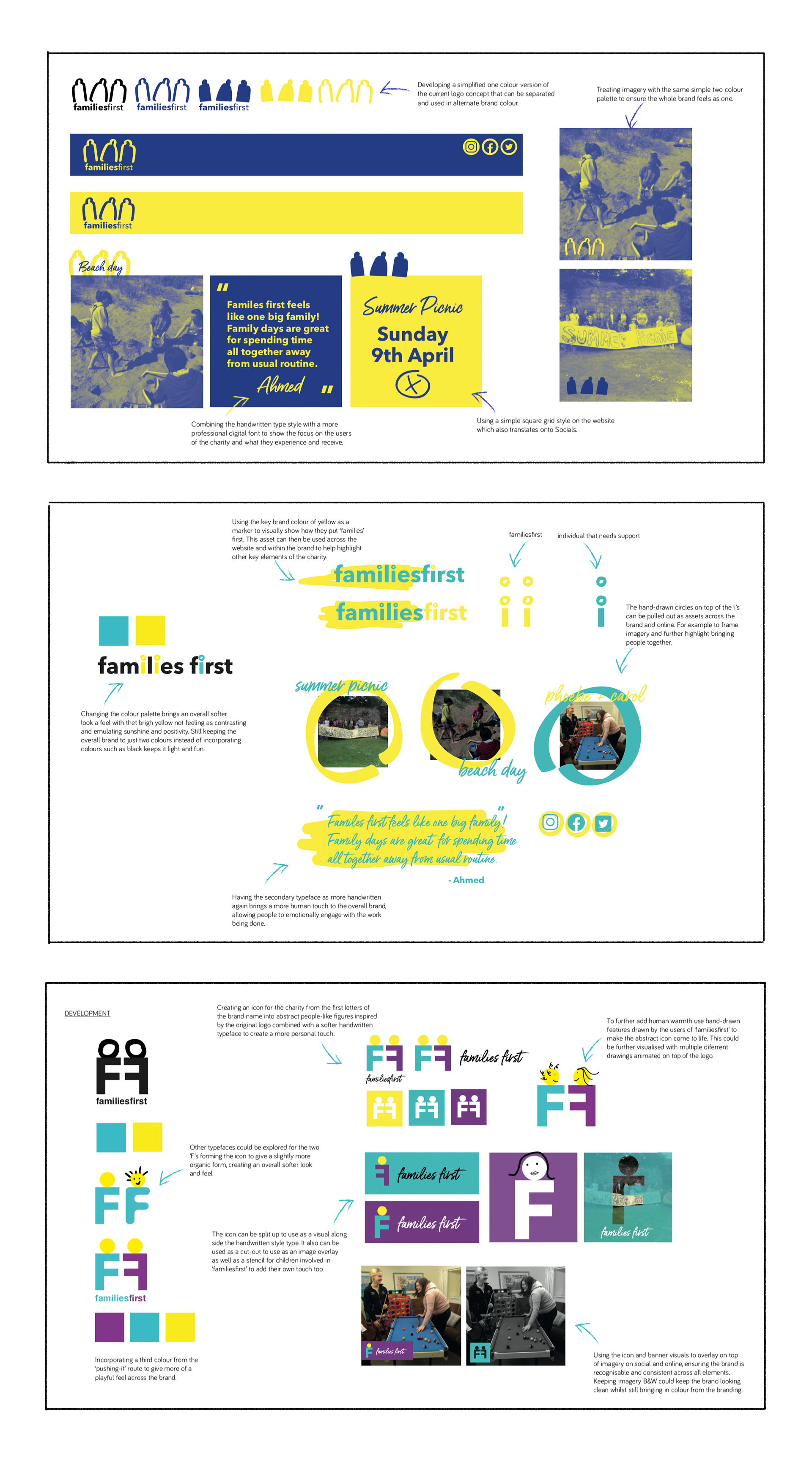
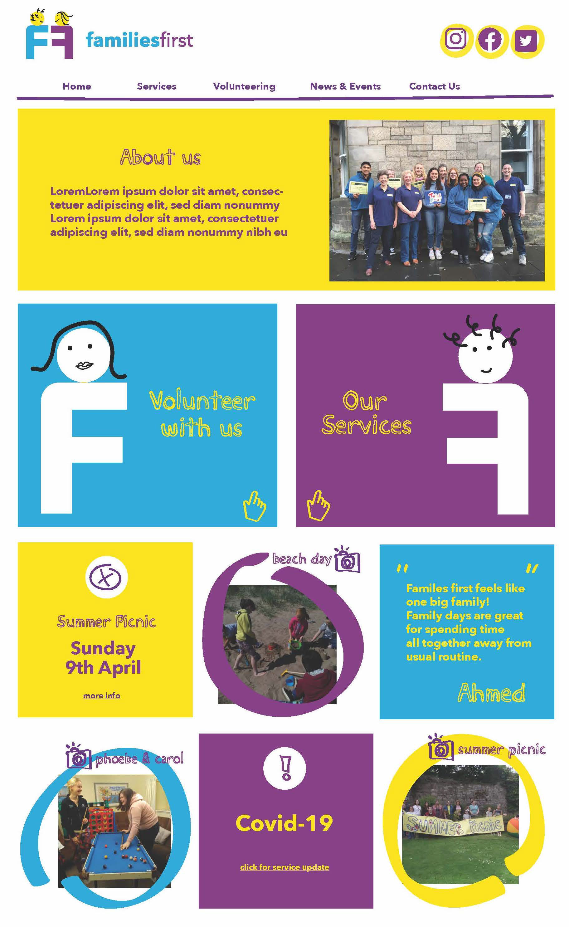
This is a project I worked on whilst I was on furlough in the initial stages of the pandemic, the client wanted a new look and feel to predominantly be taken across their website. Using their existing key visuals which consisted of a logo and colour scheme, I then researched other well-known charities visual toolkits to come up with a three new brand identities. Each one pushing the brand slightly further away from their current look and feel but ensuring I still kept the fun essence of the already very established charity.
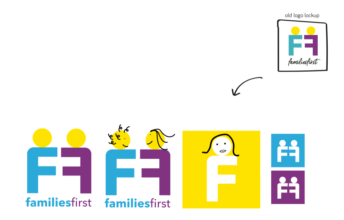
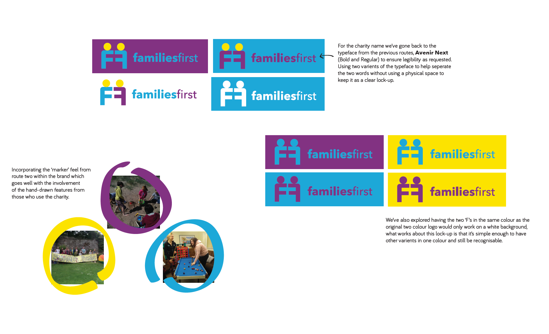
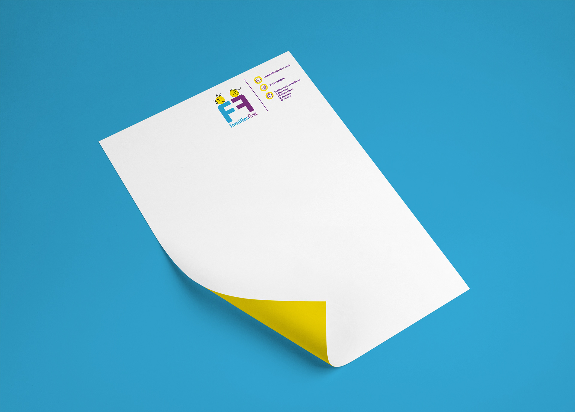
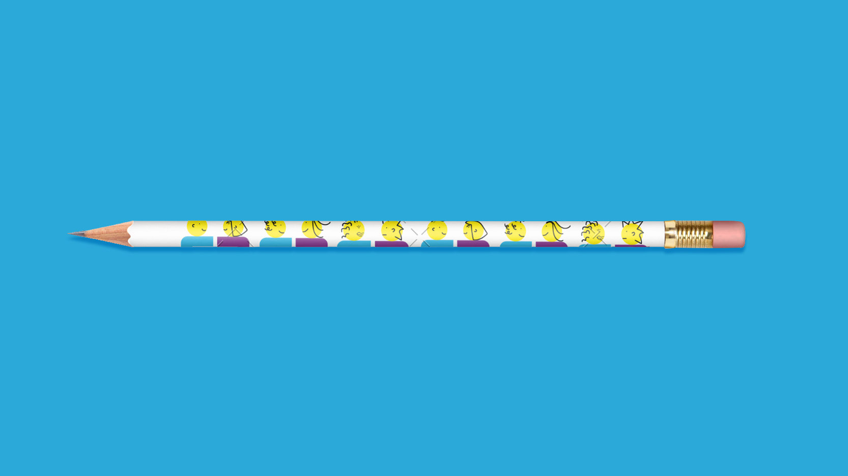
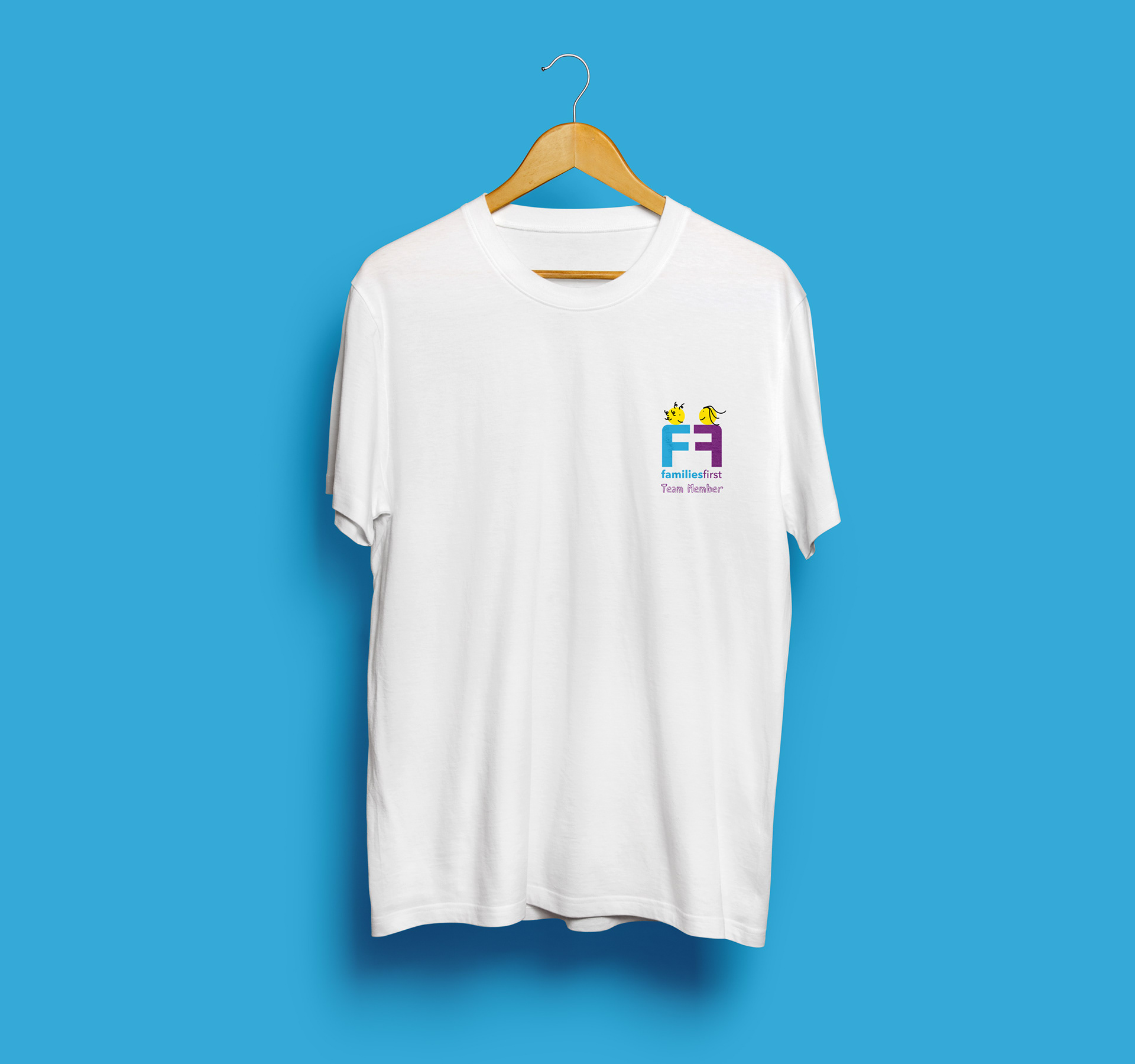
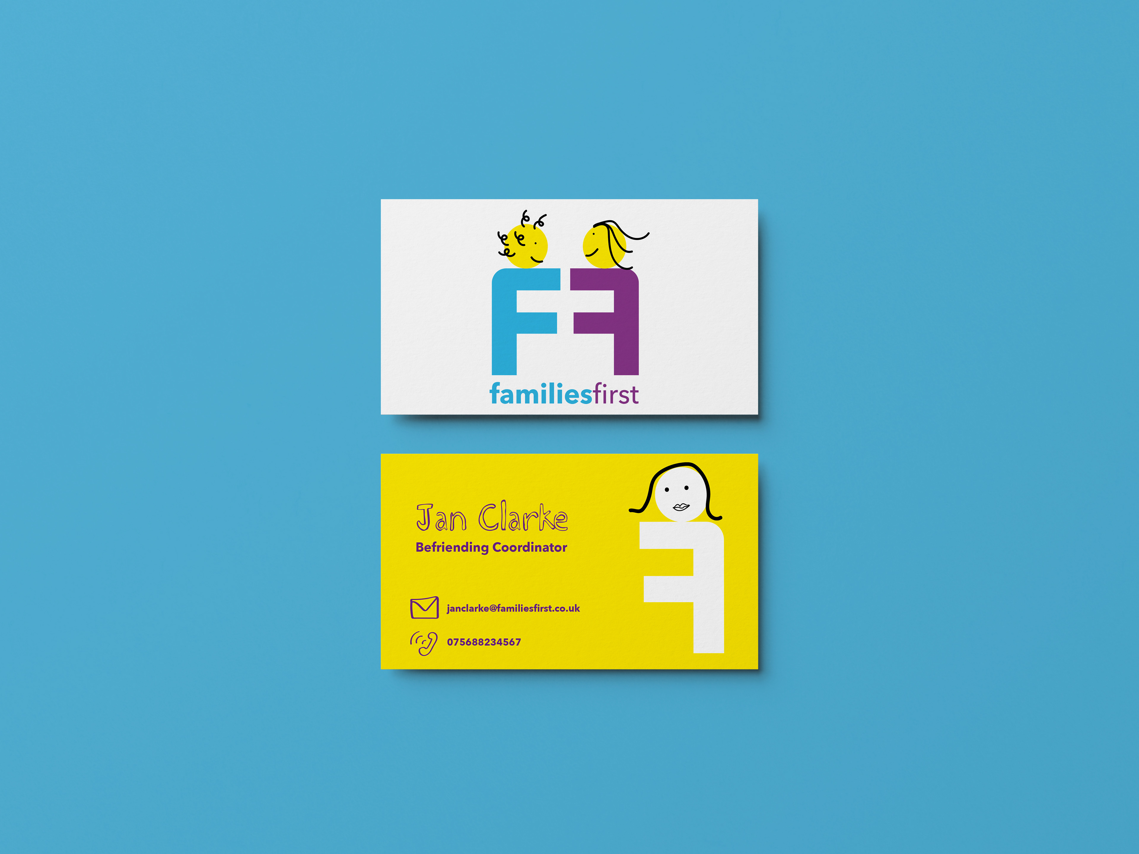
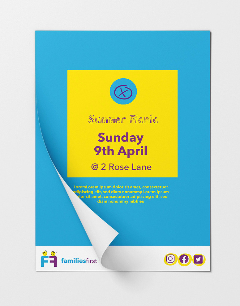
The client actually ended up choosing the bravest route so I built this out further into a new logo and key brand asset suite. Due to their main aim being updating their online platform, I then mocked up some landing pages with the new look and feel, exporting all the assets they would need to recreate it in their own existing web software. Finally I also provided some mock-ups to show how the assets could further be used in the future.