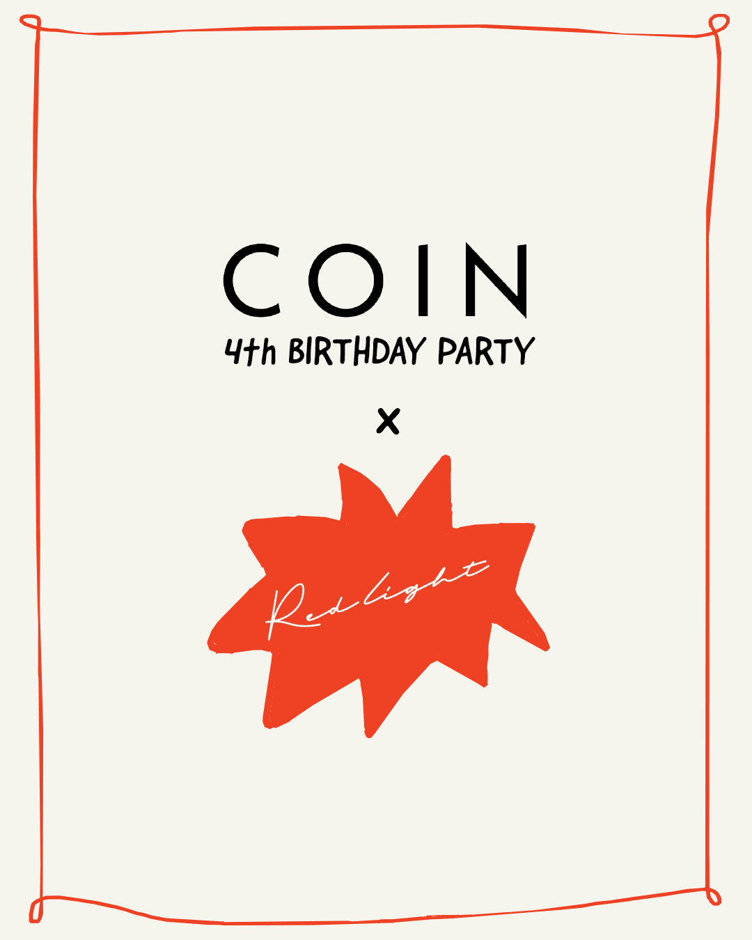
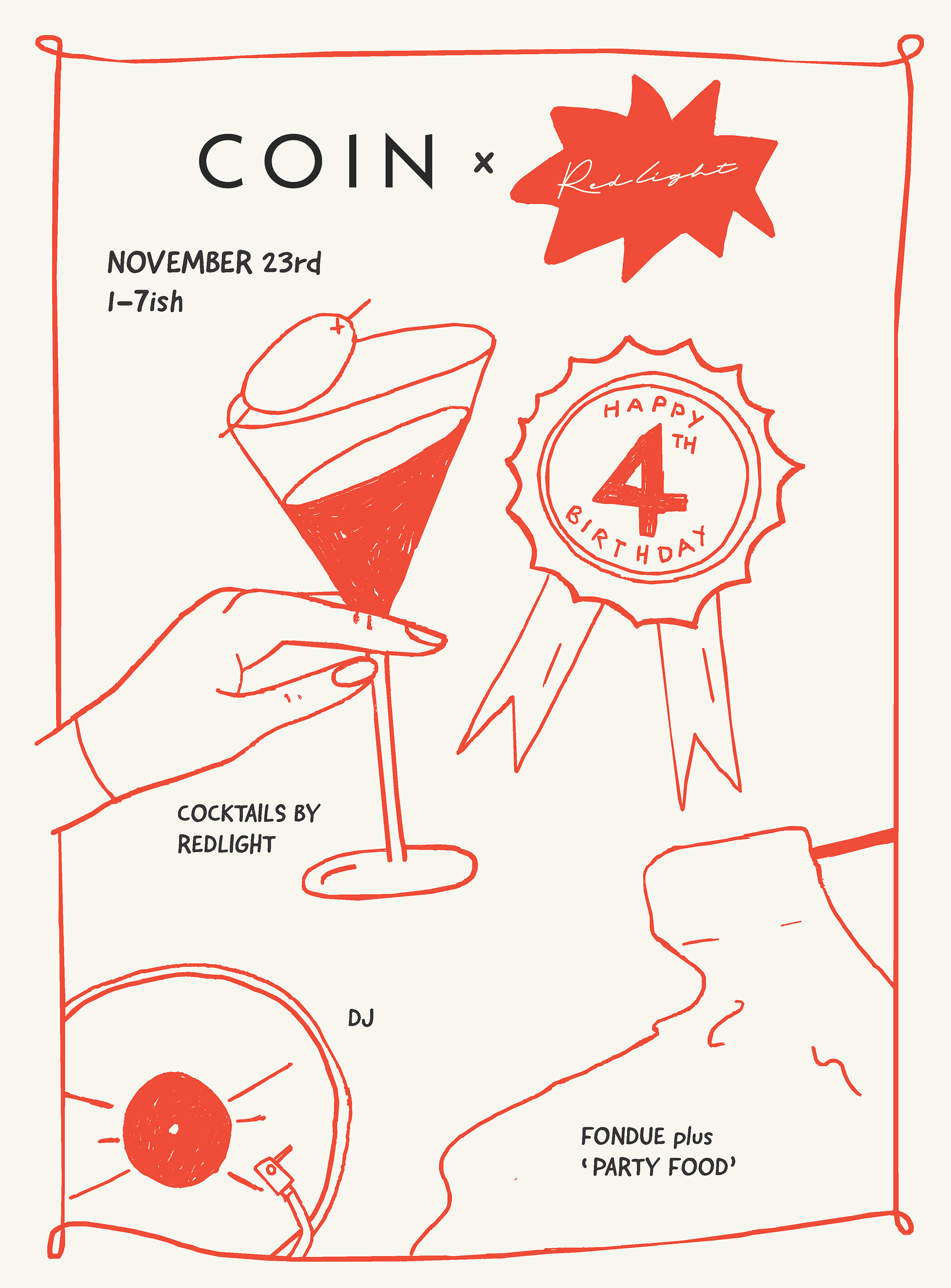
I was contacted about this project for a design that could go across socials as well as a physical poster. The vision from the client for this design was to be reminiscent of a children's party with a hand-drawn feel.
However, as the client provides a high-end service of quality food and drink I was conscious to still ensure it didn't compromise this and kept an overall minimalist look that matched the existing identity. This allowed customers to be sure the product was going to still match their normal high standard in a way that was still fun and enticed people in to attend. I did this by choosing a simple two colour palette and layout, which was able to be pulled out further in socials and not look too busy in the form of a poster.